 how-to
How to Ensure Photo Quality on Custom Gifts
Table of Contents
- Why Photo Quality Matters for Custom Gifts
- Best Resolution for Photo Gifts: What You Need to Know
- How to Fix Low Resolution Photos for Printing
- Avoiding Pixelation on Custom Photo Gifts
- Choosing the Right File Format and Color Space
- Material-Specific Quality Requirements for Custom Gifts
- Preparing Files for Large Format Printing
- Conclusion
- Frequently Asked Questions
Last Updated: September 22, 2026
Why Photo Quality Matters for Custom Gifts
A blurry custom gift is heartbreaking: you pick the perfect shot, and it arrives soft and washed out. This guide from The Crystal Gift Barn shows you how to ensure photo quality before you order.
Best Resolution for Photo Gifts: What You Need to Know
The best resolution for photo gifts is a file large enough to enlarge without losing detail: a high megapixel image saved at full size, not a screenshot or compressed copy.
Understanding DPI, Pixels, and Print Size
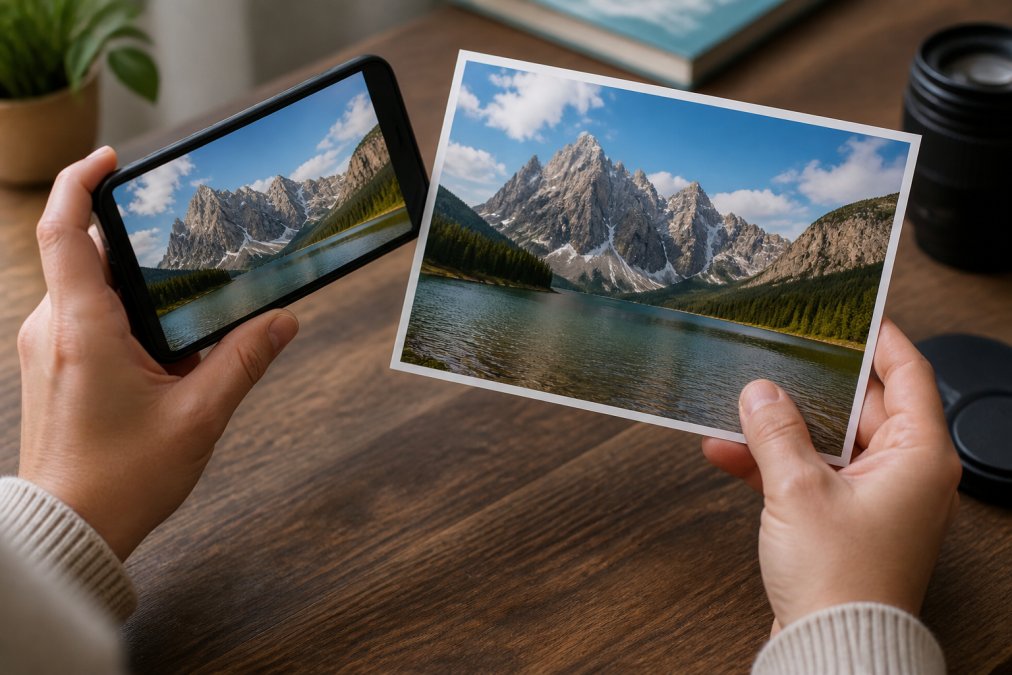
DPI (dots per inch) is how many ink dots a printer places in one inch; higher DPI means a denser, smoother image (DPI Meaning | What is DPI & How to Check/Change it). Pixels are the squares making up your photo, and their count (megapixels) sets how large it can print well.
- Small prints (mugs, jewelry): lower pixel counts can work
- Medium prints (blankets, pillows): you need a solid megapixel count
- Large prints (canvas, posters): you need the most detail of all
How to Check If Your Photo Is High Enough Resolution
On a computer, check the file info for pixel dimensions (width by height): a few thousand pixels wide handles most gifts; hundreds will not. On a phone, check file size, large usually means more detail.
How to Fix Low Resolution Photos for Printing
You can sometimes fix a low resolution photo, but results depend on how low it started. A slightly soft image often improves; a tiny, heavily compressed one is much harder to rescue. Fix the file before uploading, once the shop receives a weak file, there is little they can do.
AI Upscaling Tools for Consumers
AI upscaling tools enlarge a photo by guessing missing pixels. Mildly soft photos can improve impressively, but faces and fine textures can look odd or plastic. Use them as a last resort.
- Best for: photos that are only slightly low in resolution
- Watch for: faces and fine detail that look artificial
- Always: preview the result before you print
When to Use Professional Restoration Services
Some photos need more than a filter. Old family pictures, damaged prints, and badly faded images often need a trained eye. A restoration service can repair tears, rebuild lost detail, and bring back color.
Avoiding Pixelation on Custom Photo Gifts
Pixelation happens when a photo is stretched beyond the detail it holds, making pixels visible as blocky squares, the single biggest complaint about custom photo gifts.
Managing Aspect Ratios for Custom Products
Aspect ratio is your photo's shape, width compared to height. A phone photo is often tall; a blanket or wide plaque is not.
- Check the product's shape before you upload
- Leave some space around your subject when you shoot
- Use the cropping tool preview to see what gets cut
How to Avoid Motion Blur and Focus Issues
Motion blur comes from movement during the shot, a shaky hand or moving subject creates a smear no tool can fully fix. Focus issues come from the camera locking onto the wrong spot.
Choosing the Right File Format and Color Space
The file format you save in changes what the print shop can do: the right one keeps detail, the wrong one throws it away. But format is only half the story. The other half is color, the reason a gift can arrive looking "off" even when the photo is sharp.
File Formats: What Each One Actually Does
- JPEG: The most common format. It compresses to save space, and every re-save loses a little more. One high-quality save is fine; five are not. Watch for blocky artifacts around edges and in smooth skies.
- PNG: Lossless, so it never degrades on re-save. Best for graphics, logos, and images with sharp edges or text. File sizes are larger, which rarely matters for a single gift upload.
- TIFF: Lossless, often used by print shops and photographers. Holds up to 16 bits per channel for smoother gradients than 8-bit. Overkill for a mug, useful for a large canvas.
- HEIC: The default on many newer phones. It saves space, but some upload tools and older print workflows do not read it. Convert to JPEG or PNG if the shop's tool rejects it.
- RAW: The most detail, but it is not a finished image. It needs editing and exporting before a print shop can use it. Do not upload a RAW file and expect the shop to develop it.
A practical rule: export a high-quality JPEG or a PNG at full pixel dimensions, and do not re-save it after that.
Bit Depth: The Setting Almost Nobody Checks
Bit depth is how many shades each color channel holds: 8-bit holds 256 levels, 16-bit far more. For most gift prints, 8-bit is fine. Where 16-bit helps is smooth gradients, a sunset sky or soft studio backdrop, where 8-bit can show faint banding. For large areas of gradual color, a 16-bit TIFF gives the printer more to work with.
sRGB vs CMYK: Why Your Photo Looks Different on Screen
sRGB is the color space your screen uses; CMYK is what a printer uses. They cover different ranges, so a glowing blue may print duller and a vivid green may shift. Neon and highly saturated colors are worst, sitting outside what ink can reproduce.
- sRGB: built for screens, matches what you see on your phone
- Adobe RGB: a wider gamut, common in cameras and editing software; useful if the print shop asks for it
- CMYK: built for ink, matches what a printer can produce
- The gap: some screen colors simply cannot be printed, no matter what you do
The ICC Profile Workflow
An ICC profile is a small file describing how a specific device or printer interprets color. Converting from sRGB to the shop's CMYK profile remaps colors into the range that printer can produce, the step that prevents the "it looked brighter on my phone" complaint.
A simple workflow:
- Ask the print shop which ICC profile they recommend for the product you are ordering.
- Install that profile on your computer (most editing apps let you import profiles).
- Open your photo and use the app's Convert to Profile command, not Assign Profile. Convert remaps the colors; Assign just relabels them and makes everything look wrong.
- Choose Perceptual rendering intent for photos with lots of color, or Relative Colorimetric when accurate color matching matters more than smooth gradients.
- Save as a new file so you keep the original sRGB version.
Soft-Proofing: See the Shift Before You Order
Most editing apps have a soft-proof mode. Turn it on, select the shop's ICC profile, and the screen previews the printed result; colors outside the printer's gamut get flagged or shift. It is the closest you can get to seeing the final gift before it is made. If a color shifts badly, accept it or pick a different photo.
International Color Consortium overview of ICC profiles
Material-Specific Quality Requirements for Custom Gifts
Different materials show photo flaws differently, so a file that looks fine on one product can look weak on another. Matching photo to material is a step most shoppers skip, and it is where the biggest quality surprises happen. Each substrate has its own surface, ink behavior, and viewing distance: glossy metal reveals every speck of noise, a woven blanket softens edges, and a curved mug distorts the image at the edges.
A Material-by-Material Breakdown
Canvas
- Surface: woven texture that breaks up fine detail
- Hides: small flaws, mild softness, slight noise
- Punishes: overly sharpened files, which look crunchy against the weave
- Best source: strong composition, moderate detail; a 12 MP phone shot is plenty
- Watch for: the wrap, so keep important content away from the edges
Metal prints
- Surface: glossy or matte coating over a rigid panel; glossy versions are highly reflective
- Hides: almost nothing
- Punishes: noise, JPEG artifacts, and softness, all magnified by the reflective surface
- Best source: a clean, well-lit, sharp, low-noise file; shoot at low ISO if you can
- Watch for: viewing angle, a glossy metal print looks different across the room than up close
Blankets and woven textiles
- Surface: fabric that absorbs ink and diffuses detail
- Hides: fine texture, small blemishes
- Punishes: low-contrast, flat images that turn muddy
- Best source: strong contrast and clear subject-background separation
- Watch for: the weave softens edges, so busy shots with many small faces lose them
Ceramic mugs and tumblers
- Surface: curved and often glossy
- Hides: some detail loss is expected from the curve
- Punishes: important content near the edges, which wraps out of view
- Best source: a centered subject with margin; simple backgrounds work best
- Watch for: the wrap, preview the mockup and check nothing important sits near the curve
Acrylic and glass
- Surface: clear and reflective, with a printed layer behind or on the surface
- Hides: little; the clarity is the point
- Punishes: dust, scratches, and noise in the source file, all of which show through
- Best source: a clean, high-resolution file, where a 16-bit TIFF or high-quality JPEG earns its keep
- Watch for: reflections in the final product, a display issue, not a file issue
Wood plaques and hard surfaces
- Surface: varies from smooth to grained, often matte
- Hides: a little, depending on the grain
- Punishes: soft focus and low resolution, since the flat surface shows every flaw
- Best source: the sharpest file you have; treat it like a large print
- Watch for: wood grain interacting with image texture, so busy photos look cluttered
Jewelry and small items
- Surface: tiny, often curved or domed
- Hides: a lot, because the print is small and viewed up close
- Punishes: busy compositions that become unreadable at small size
- Best source: a tight close-up with a clean background; a face or single subject works best
- Watch for: the crop, at this size, a small change moves the whole composition
How to Match the File to the Material
A simple decision path:
- Identify the material and its surface (glossy, matte, woven, curved).
- Estimate the print size and the typical viewing distance.
- Pick a source file with pixel dimensions that cover the print size at the shop's recommended resolution.
- Check the product mockup for crop and wrap before ordering.
- If the material is glossy or rigid, be extra strict about noise and sharpness.
- If the material is woven or small, prioritize contrast and a simple composition.
Preparing Files for Large Format Printing
Large format printing is unforgiving: every flaw gets enlarged along with the good parts, so enlargement turns a small weakness into a big problem. Before uploading for a large print:
- Start with the largest, highest-quality version of the photo you have
- Check the pixel dimensions against the product size
- Crop to the product's aspect ratio using the preview mode
- Convert the file to the color profile the print shop requests
- Save at the highest quality setting, not the smallest file size
- Review the full-size preview one last time before ordering
Conclusion
Getting a custom gift right comes down to the file you send. A sharp, well-sized photo with the right color profile prints beautifully; a compressed, low-resolution one disappoints, no matter how good the product is.
Frequently Asked Questions
What is the minimum DPI required for high-quality custom gift printing?
Most print shops and custom gift platforms recommend a minimum of 300 DPI (dots per inch) for photos that will be viewed up close, such as on plaques or jewelry. For larger items like blankets that are viewed from a distance, 150 DPI can work. Always check the specific requirements of The Crystal Gift Barn or your chosen printer before uploading your file.
How can I tell if a photo has high enough resolution for printing?
Check the image's pixel dimensions in your photo editing software or by right-clicking the file and viewing its properties. Divide the pixel width by the desired print width in inches. If the result is 300 or higher, you are in good shape. For example, a 3000-pixel-wide photo can print at 10 inches wide at 300 DPI without losing sharpness.
Does resizing a photo for a custom gift cause quality loss?
Yes, enlarging a photo beyond its native resolution causes pixelation and blur. Shrinking a photo generally preserves quality. If you must enlarge, use AI upscaling tools or order a smaller gift size that matches your photo's resolution. The Crystal Gift Barn's preview mode shows how your image will look before you order.
What file formats are best for uploading photos to custom gift sites?
PNG and TIFF are best for preserving quality because they use lossless compression. JPEG works well if saved at maximum quality, but repeated edits can introduce artifacts. RAW files offer the most flexibility for editing but may need conversion. Always avoid screenshots or images downloaded from social media, as these are often compressed and low resolution.